Bloomingdale’s Browse Experience
ROLE
Art Direction, UI, UX (Consulting)
LAUNCH DATE
Early 2019
Overview
Everyone has experience with browse grids. Mostly we shop on them daily, whether you’re surfing Amazon for household items or picking out a new Macbook on Apple. Clothing is one area we really tend to get lost in especially if the browse grid is seamless. Ideally, it loads quickly where I don’t notice a delay, the filters are helpful and pull up relevant results and the images are not only good quality but large enough to get a clear scan of the product to decide if I like it (of course a wishlist button is a nice addition).
We noticed people weren’t shopping our site the same way they do on other e-commerce sites. Why? The page is not responsive, there’s too much information under each product, super slow page loading times, and unhelpful filtering which sometimes leaves them in a dead end. Well, when we see a problem this large, we create a lean lab that focuses on solving it. So with a team of 2 remote backend developers, 2 product designers, 3 front end developers, a tech lead, a product manager, a QE and a copywriter, we set to work.
Objectives
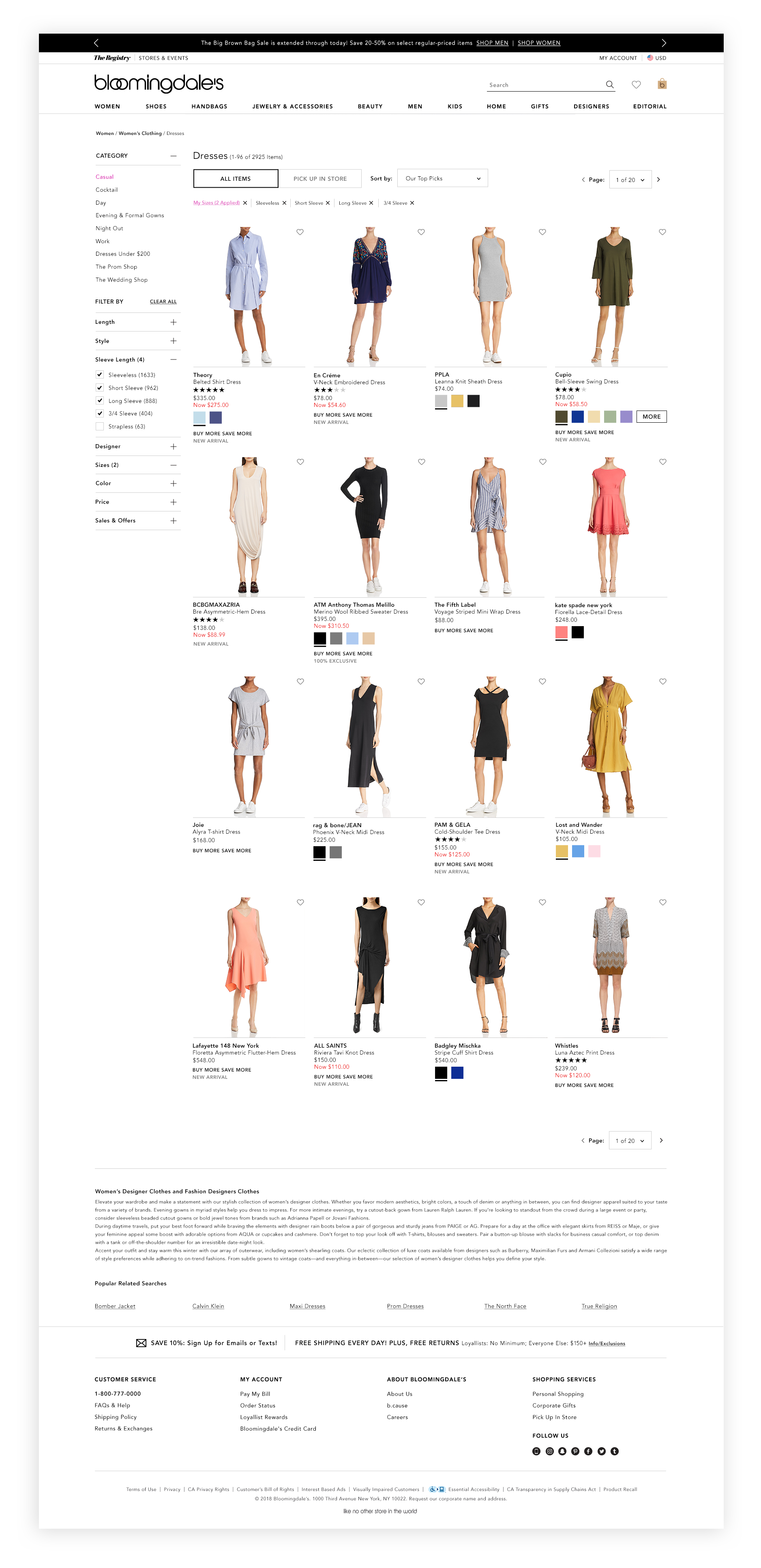
• Make the page responsive (Predetermined breakpoints – 1440px max content width, 1024px, 600px)
• Move the filters to the left (this feature was tested previously against horizontal navigation above the grid. The left side won, but the highest stakeholder preferred the horizontal nav that didn’t test well)
• Increase Image size
THE APPROACH
While the product designers (myself included) worked together to come up with a wireframe, the developers set out to set up the framework for the page to go responsive. Product design created a wireframe and stakeholders approved in review at Lean Lab showcase. Developers were involved along the way to let us know if there were any constraints or concerns with what we were proposing.
This project also influenced the marketing design team who creates all banner assets, so I worked with the associate creative director from that team to come up with proper guidelines for implementation. In some cases, the banners can be shut off, but there should be room for at least 2 assets at the top of the page and consideration for an additional asset to be placed into the product grid below.
The responsive grid was created first, and the filters were forced to the left. The prefooter was next, with a blurb for SEO which I tried to truncate, and despite getting a thumbs up approval from our dual brand partners at Macy’s Analytics, Bloomingdale’s stakeholders like keeping the length. As time went on, we gave specific UI treatments for what was under each filter and checked for QA. Every member of the team had to test the product and track bugs. The team worked on the banner assets and H1 elements after speaking with the codependent marketing team. After that it was time for the nitty gritty details of what falls under each product on the grid and how it is styled. Guess how many stakeholders that has…it felt like everyone in the office had a strong opinion, so we eliminated no product information from the underneath the product images and after a long debate about what should be red, vs bold or maybe pink we started development. Though we kept the pagination, we did try out a seamless scroll but tech felt with the sheer volume of products the site carries, it may not be the best option.
NEW FEATURES & UPDATED PAGES:
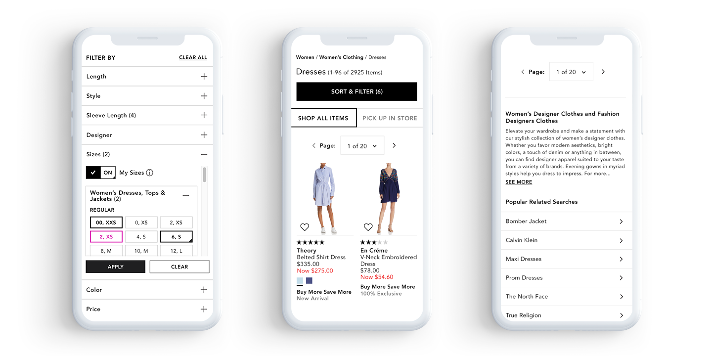
BOPS (buy online pick up in store) filter added to top
Smaller wishlist button
Removed quick view and then added it back only for desktop because the key stakeholder liked the feature.
Created a rule for home images – home images are square vs. clothing, shoes etc which have a rectangular aspect ratio. This was decided by the home & photo team because home images looked better as a square but creates a disjointed look for the site. Going forward all images for home will be either reformatted when submitted or shot on white.
Zero search results – this page previously led you to a dead end with no product recommendations
Category landing page – Women, Men, Kids etc – I worked closely with the marketing design team and developers to make sure all requests were met since that team creates all of the editorial assets for this page.
Designer Index – this was just a clean up and responsive effort.

Above: Left – filters feature Saved size facet – user can save their preferences. Middle – Added feature for shopping by store pick up. Right – related search terms
Below: Desktop browse experience.

THE RESULT
We were able to increase time spent on a page, overall traffic increase, and hopefully some of that was new customers who enjoyed their shopping experience. The mobile shopping experience was greatly improved by adding a filter drawer rather than a drop down which made the experience more meaningful and easier to navigate. Customers were no longer getting dead ended by zero search results pages, and they had the added benefit of seeing what was available in a store near them.
Reflection and Future
In the end, I think we worked around our roadblocks. I would have liked to test a version of the browse grid with simplified product details. I also requested that we add the BOPS (Buy Online Pick Up in Store) to the filters on the left as a checkbox that you could select; that would’ve been another good test for down the road.
Overall I would’ve liked to test more and lean more towards best UX practices rather than stakeholder feelings. I worked on additional features which were added after the release of responsive browse. These features include saved size facets, in which a customer can save their size preference and filter automatically when logged in.


