The Little Registry Redesign
CLIENT
Bloomingdale’s
ROLE
Art Direction, UX/UI, Prototyping
VALUE ADDED
Over $12 Million in Added Revenue
OVERVIEW
The Registry site at Bloomingdale’s was a long neglected part of the website where tumbleweeds roamed (yes, digital tumbleweeds). It was a lawless place where good product design didn’t exist and nothing new was ever implemented or tested. With a shudder you would enter into a confusing world of legacy pages crying out in agony. Though many did competitive research on other sites no one could quite figure out how to afford such an overhaul to revitalize this section of the website.
So it all began one day over the long dark holiday code freeze, I created a competitive analysis quietly at my desk. I signed up for every registry that ever existed and poured through every page and detail of their experience. I read reviews from users on the various platforms and began cobbling together a rough idea through sketches and examples I found. Compiling all the best features I started to build out a north star experience that I thought would get people excited about what our registry site could be.
I took my prototype and peddled it like a door to door salesman. First to my boss to rally support, then to her boss, then to our Group Creative Director, the head of marketing, the director of the site itself and then the entire development team. The development team had one question, when can we get started?
Well, ‘twas the season for new year budgets so when the stakeholders reviewed projects for the upcoming year my registry redesign was awarded $1.2 million in funding and would run as a lean lab that upcoming year. (lean and agile product structure containing 2-3 backend devs, 3-4 front end devs, one product manager, one scrum master, one QE, a tech lead, a copywriter, 2 product designers.)
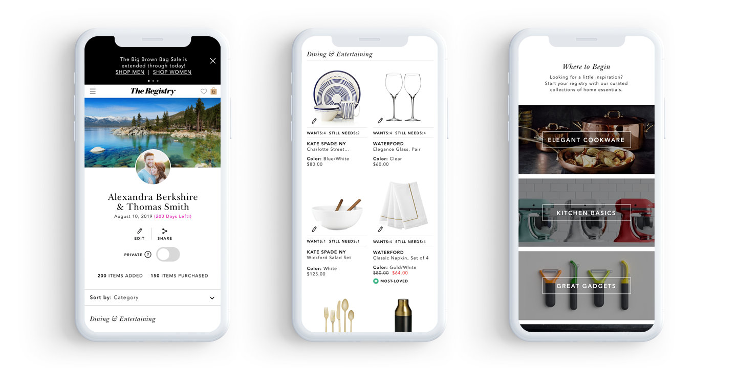
Shown above (from left to right): Bride’s View of Registry North Star version with personalization, BVR added products and most-loved items, Empty registry with curated categories.
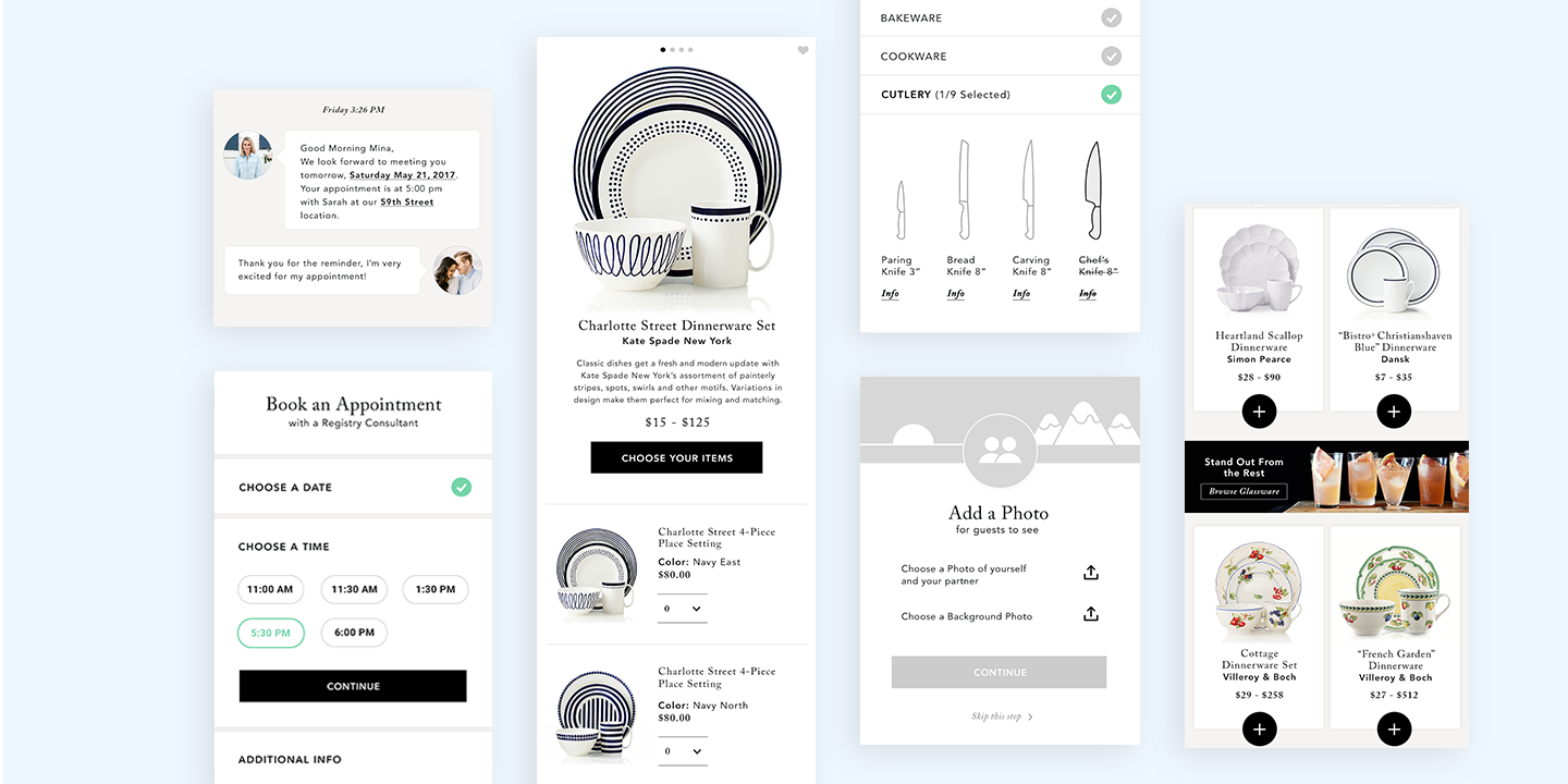
Shown above: Other fun features baked into the initial pitch for funding. Features include, personalization, additional interrupter ad space, simplified product detail pages, appointment scheduling, consultant chats and interactive registry checklists.
The Redesign Approach
Before the lean lab kicked off for the year we had to get a few things straight. The product manager and I reviewed the competitive analysis I had created for the pitch. UX and I performed a comprehensive audit of our current registry site. We found that we had a lot of repetitive links within pages, many frustrating and convoluted rabbit holes to buy a product as well as some major unnecessary pages that were confusing our customers. The product manager pulled what she could from customer feedback to analyze the problem. Most customers were frustrated; some were outright angry responding in profanity.
Based on our research, the product manager created a year long roadmap of features to tackle and ranked the features with senior leadership. All the while our developers toiled away setting up the framework for our endeavor. As it turns out the registry was so old that almost all of the pages were legacy pages. Our backend developers worked tirelessly with our front end guys to get a new framework in place to match the rest of the site. The number one priority across the whole product organization was to go responsive on all pages going forward. The registry site legacy format could not handle such a request.
Lean labs operate on producing the MVP (minimum viable product). So we scaled back from our north star, and figured out which pages would generate the most revenue and have the most benefit from a redesign. Then, we determined what could be saved for later during code freeze that we could launch post freeze.
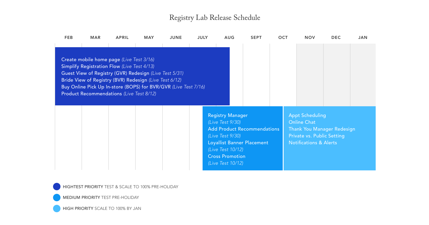
Insight into A LEAN LAB Process for Tackling an MVP
For Lean Labs generally 2 weeks is the average to work on an assignment, but since sizes vary, the team would point the features above and determine how long we thought it would take to produce. Back end and front end work together to set up any framework needed while product design works on a wireframe to get approved by stakeholders. Once stakeholders approve, UI begins and gets stakeholder approval. Most approvals come from a Lab showcase in which we present our work and process to the stakeholders on screen with our entire Lean Lab team. Each week I present my upcoming feature on screen after the development team presents their progress on the feature at hand. Before this lab ended my user experience designer left the team so I took over UX as well creating high fidelity wires.
Below: Example of a site map for a section of registry – focus here is on the registry manager.
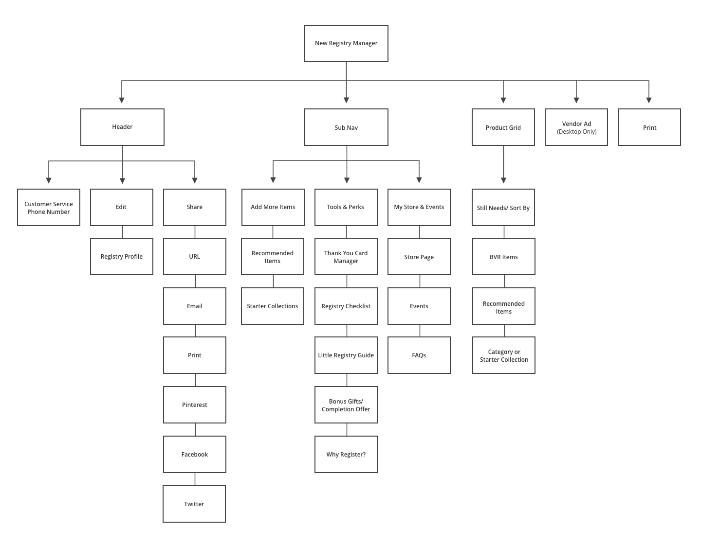

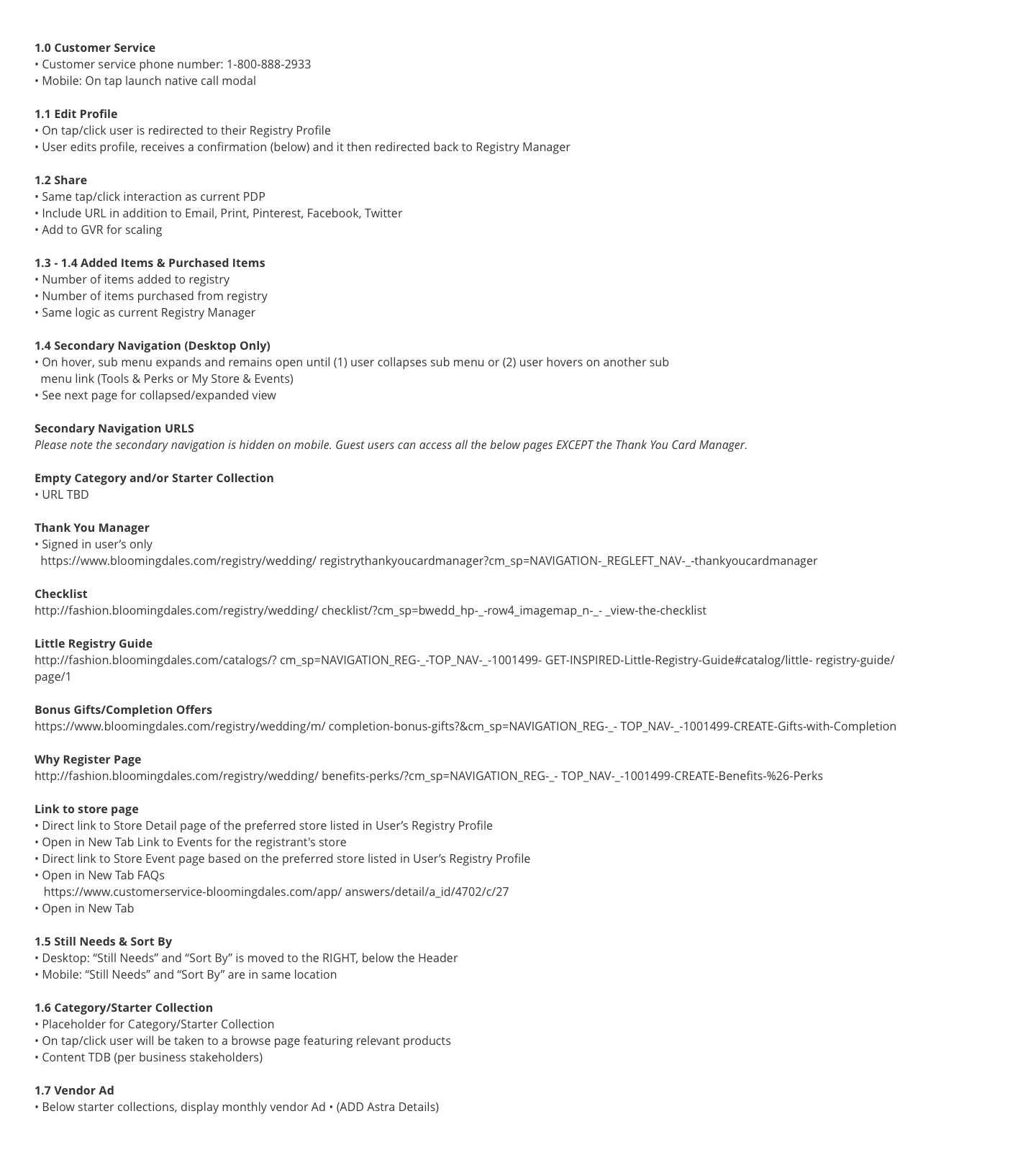
Above: High level wireframe example for Registry Manager feature. Agile updates made in the UI phase based on feasibility and feedback. Note: Not all annotations listed here, some are dependent on other features and may have been addressed in previous wires.
KEY UPDATES
Across all features the team accomplished making all pages responsive. Additionally, optimized for SEO and page load time which were two initiatives given across the entire product organization.
A major point of confusion for Couples was that we had registry management page and a Bride’s view of registry. No one knew what the difference was or what they were supposed to do within each of these features. In order to eliminate this problem I came up with a solution to combine them into one useful platform by turning the manager into a secondary navigation within the Bride’s View of Registry. I ran in-person user testing with my product manager in the office. We gathered volunteers from other departments unrelated to our own and asked them to try out the new functionality of the guest and bride view with the newly incorporated registry manager. The rest of the features went live to 50% of traffic to test for 30 days and then revised based on analytics. The key performance indicators (KPIs) we focused on across most of registry were: Higher added perceived value of items added to registry, higher add to bag rate on guest view of registry, higher order conversion on guest view of registry, lower call volume to consultants and customer service, higher satisfaction and referrals, and increased engagement with the product.
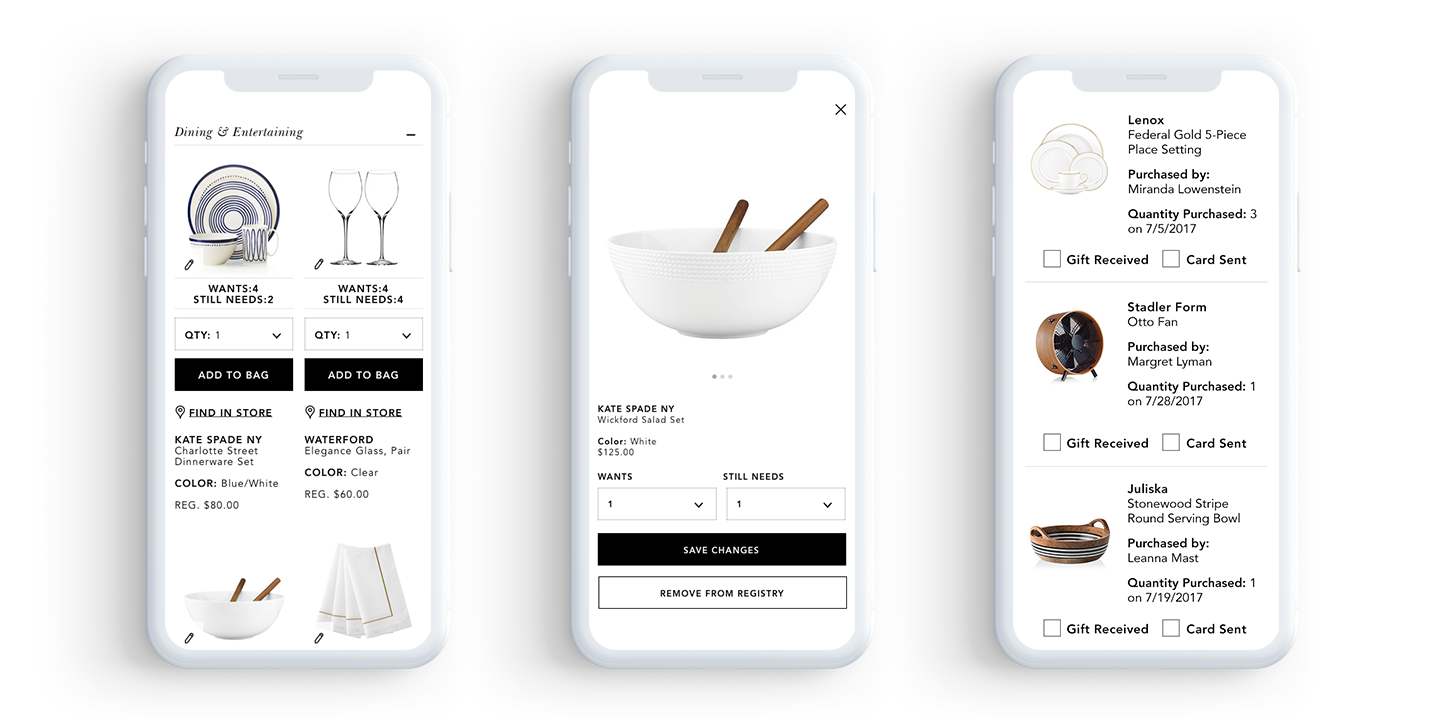
These are just a few screens from what went live. Left: Guest View of Registry grid, Middle: Add to Registry overlay clean up, Right: Thank you manager

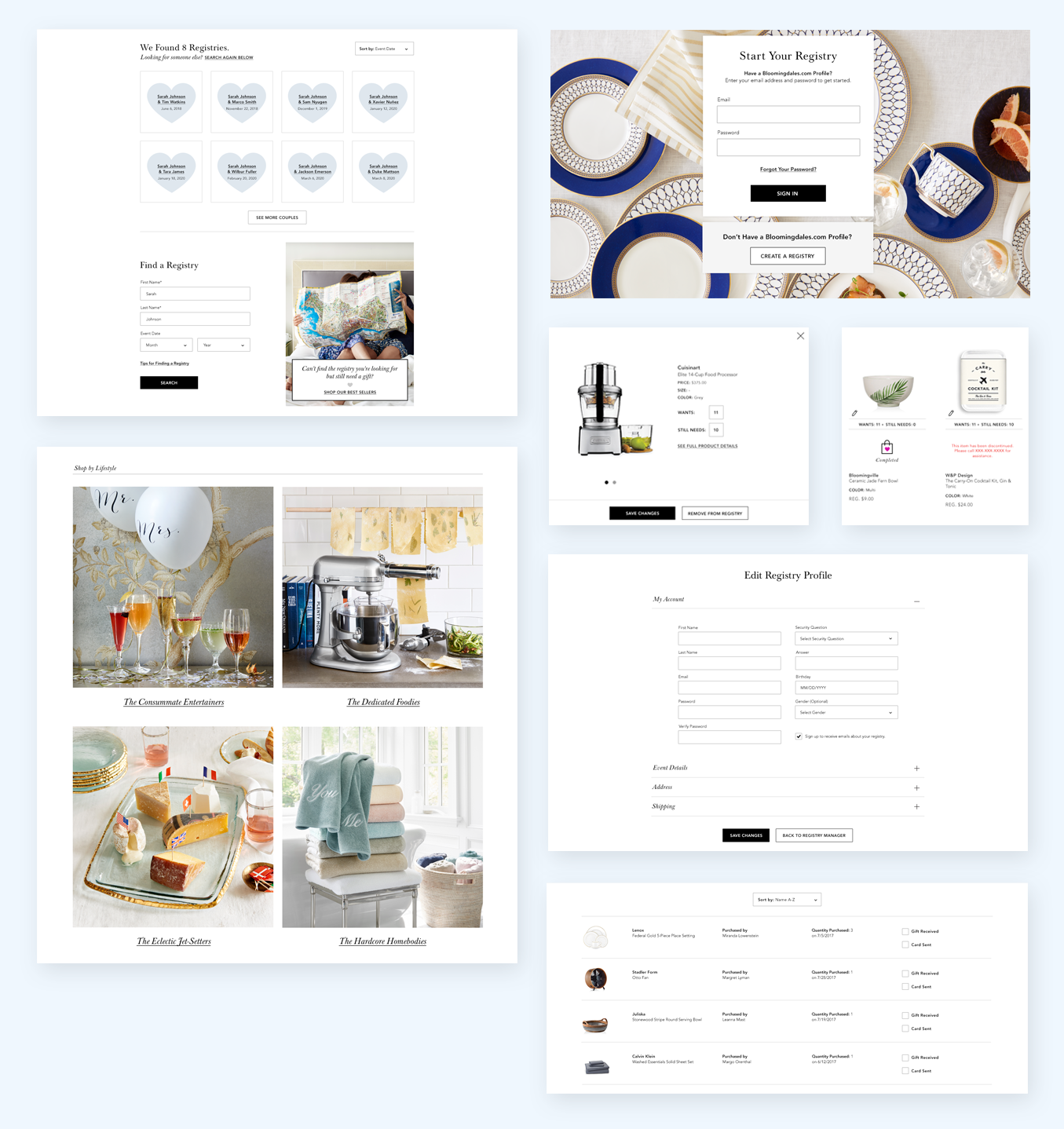
Above & Below: A few of the most dramatic redesigned pages that went live (View the live site by clicking the button at the top of the case study).
Little Registry, Big Success
We exceeded our goal of $12M increase in revenue before the year end with a total of $12.6M increase by December. There was also a small lift in registry creations which is a great start considering this part of the site had long been neglected in previous years. Working in tandem with the development team and analytics, we were even able to do a few smaller tests on the side and make some UI updates that were in our back pocket as a nice to have. Foresee comments started to come in from happy customers ecstatic about the ease of use of the new Registry site.
Reflection and Future
As with all MVPs, if you started with a north star prototype you have to scale back for the minimum product. Keeping that in mind, I had some features in my original prototype that offered more personalization for the customer. Many comments we received across the entire e-commerce site were regarding personalization. While this was not a target for the MVP I did take steps to ensure a framework was in place in case we wanted to explore a future enhancement.
Here are a few examples:
Personalization – Color Background Content placeholder behind the Registrant’s information where in the future we could allow the user to choose their own image (currently there isn’t a backend system in place to store the images). I also created a great feature called “Top 5 favorites” to help Couples rank their most-loved items.
Collections – Something like this could easily turn into a more editorial experience for this brand, but for the MVP we hardcoded a few trendy categories based on the Little Registry Guide initiatives for that year. Collections would take you to a browse experience with items chosen by the sales team but in the future would ideally tie into the Little Registry guide and have more of a voice and personality.
Recommendations – Currently there isn’t a system in place to create smart recommendations for a Bride. The product recommendation panels algorithms misses the mark a little bit. For the time being, I made space for them, but the recommendations are hard coded by the sales team with items that are top sellers in their categories.
Checklist – More interactive and dynamic checklist would be nice to have. Currently The Little Registry has a printable pdf. I had also pitched a Style Quiz to help get a more curated collection for our couples to shop from.
Wedding Shop – Bloomingdale’s has formal wear in the likes of suits, dresses, and shoes etc.The idea was to create space within the registry manager navigation to house this cross promotional opportunity.
Gift Card Registry – Sadly this requires quite a bit of backend work in order for a couple to register for a gift card, but ideally in the not too distant future they will be able to.
Navigation – Registry had some of the oldest navigation on the site and many UX problems that needed to be addressed, but this was largely out of scope and an undertaking all its own.
The good news is the following year I got to rework the entire navigation across the whole site: international, domestic, minimal and Registry!


