Global Navigation Redesign
CLIENT
Bloomingdale’s
ROLE
Art Director, UI, UX (Consulting)
OVERVIEW
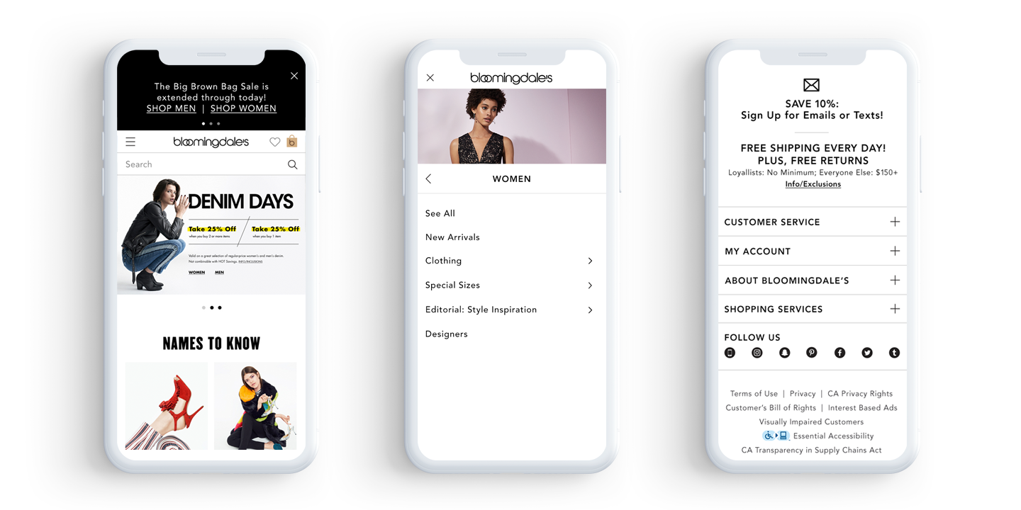
The navigation redesign was a large enhancement as part of the year long responsive initiative given by stakeholders of the website. This project is very high profile, and everyone seems to own it. Each facet of business (Women, Shoes, Kids, Registry, etc) has its own stakeholders who each have their own set of requirements and need to review. So there were a lot of cooks in the kitchen for this one. For this project we had 2 product designers, 3 offshore developers, 1 in-house tech lead, 1 QE and 1 copywriter.
OBJECTIVES
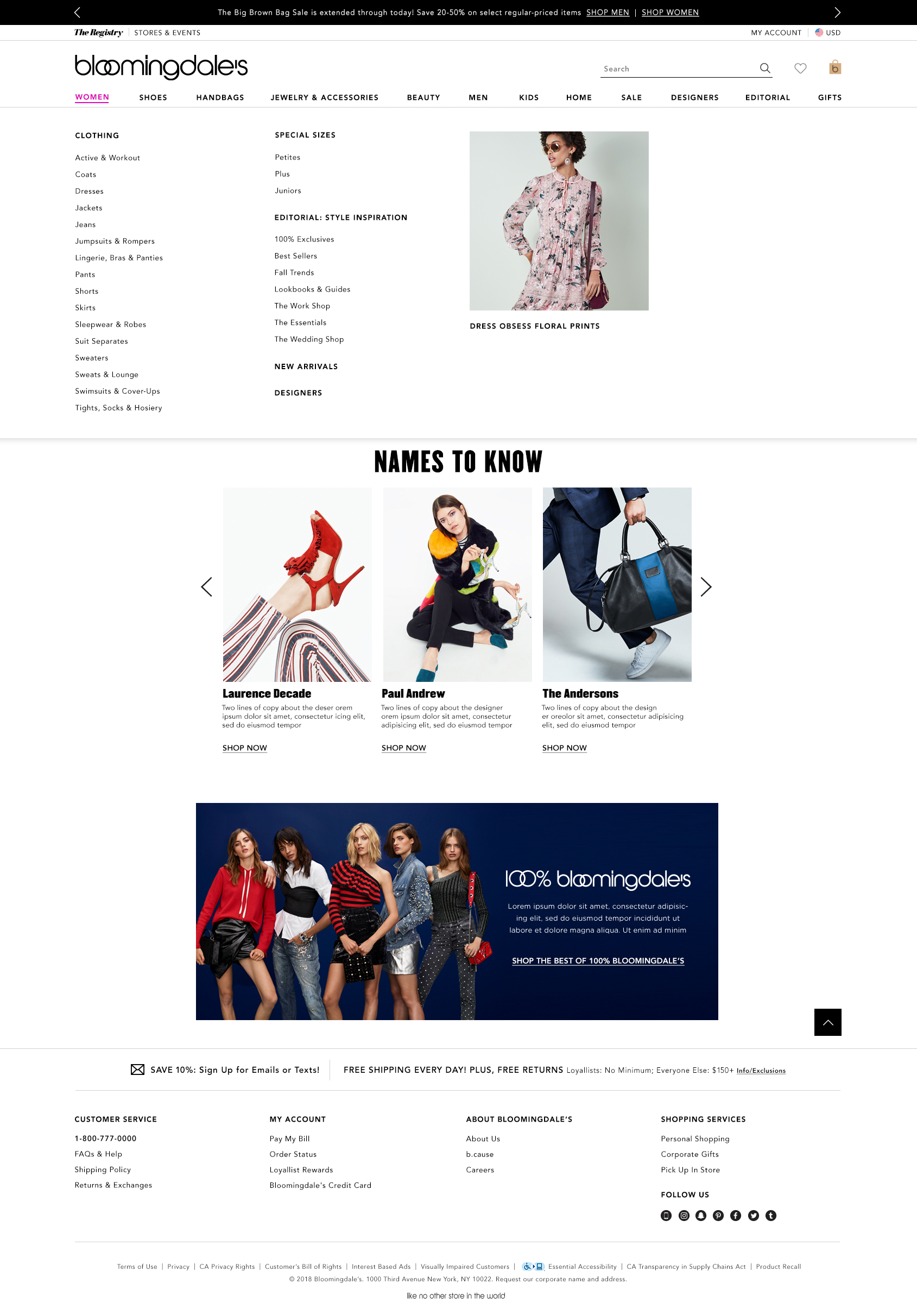
• Make the navigation responsive (Predetermined breakpoints – 1440px max content width, 1024px, 600px)
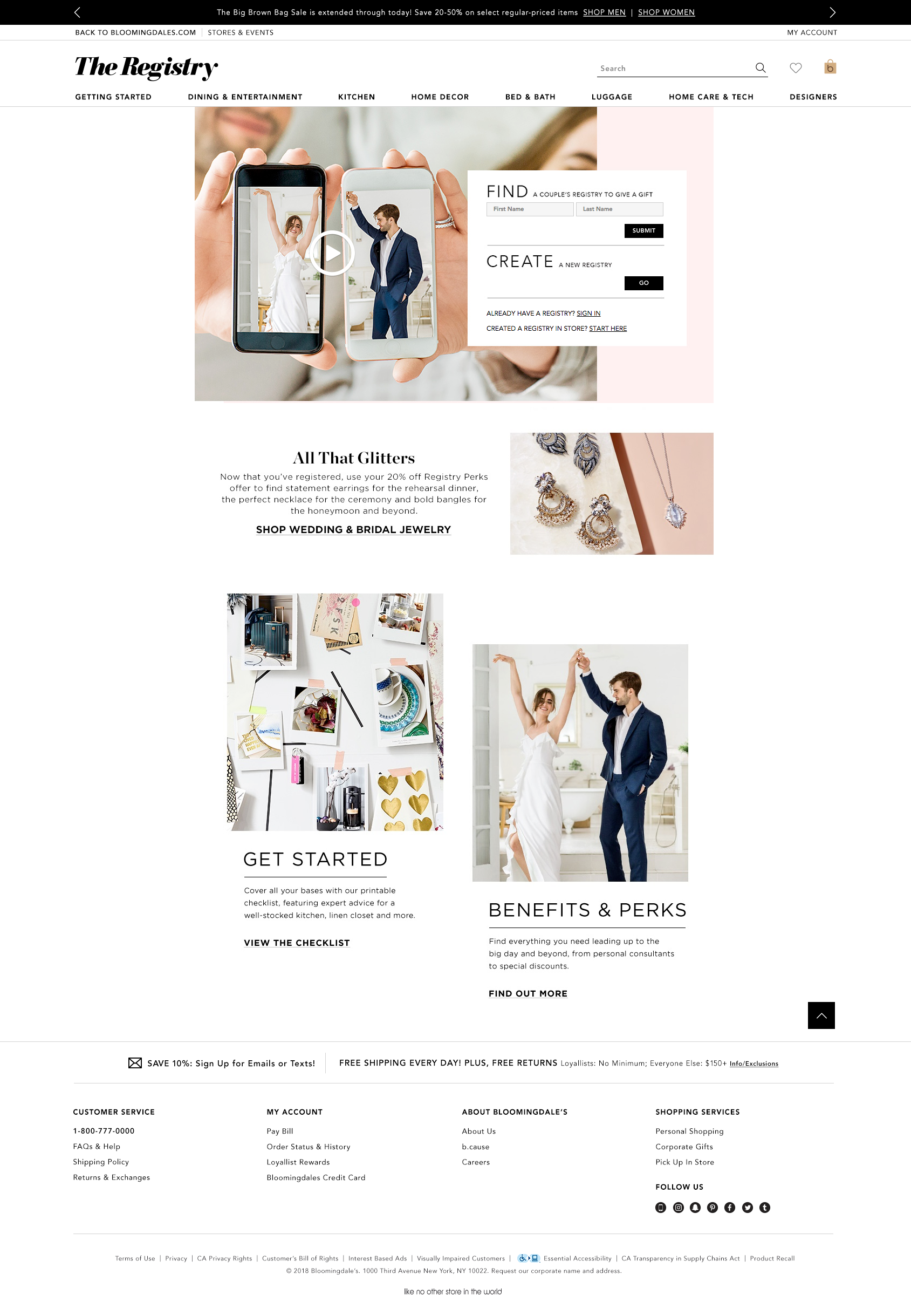
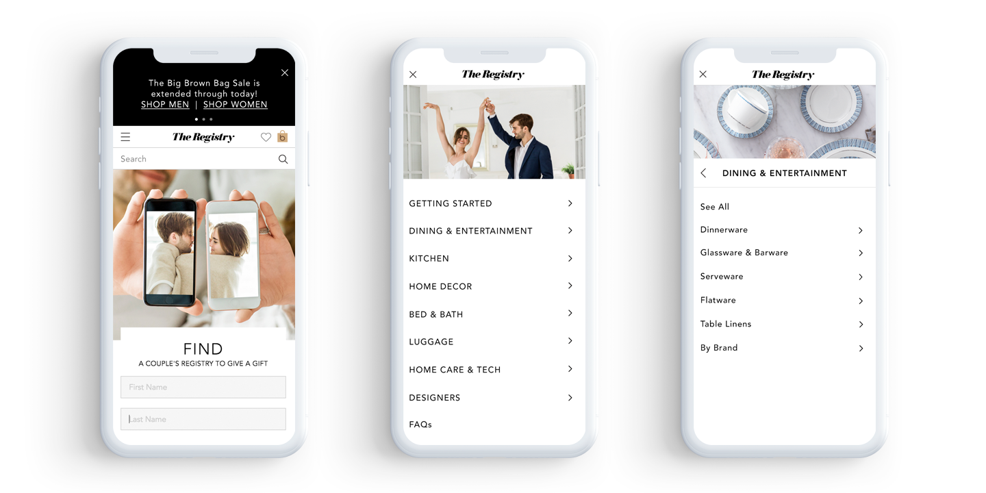
• Update the Registry Navigation Experience
• Clean up the UX across the navigation
• Create a cleaner, more premium feel to the navigation
• Figure out a more elegant way to incorporate promotions and banners
The Approach
Together with the other product designer, we gathered up competitive research documenting the most enjoyable navigation experiences. We made a list of features we’d ideally like to update or things we were just plain missing. Through several brainstorming sessions we came up with a wireframe for the domestic site that we thought ironed out the problems and then opened it up to a barrage of stakeholder feedback. After several months of very arduous rounds of stakeholder feedback revisions, we finally came to an agreement. Development began setting up the framework and any necessary backend updates while I worked out the new face of our navigation working closely with the marketing design team to create the proper spec for assets they would be handing off in the future (mainly banners).
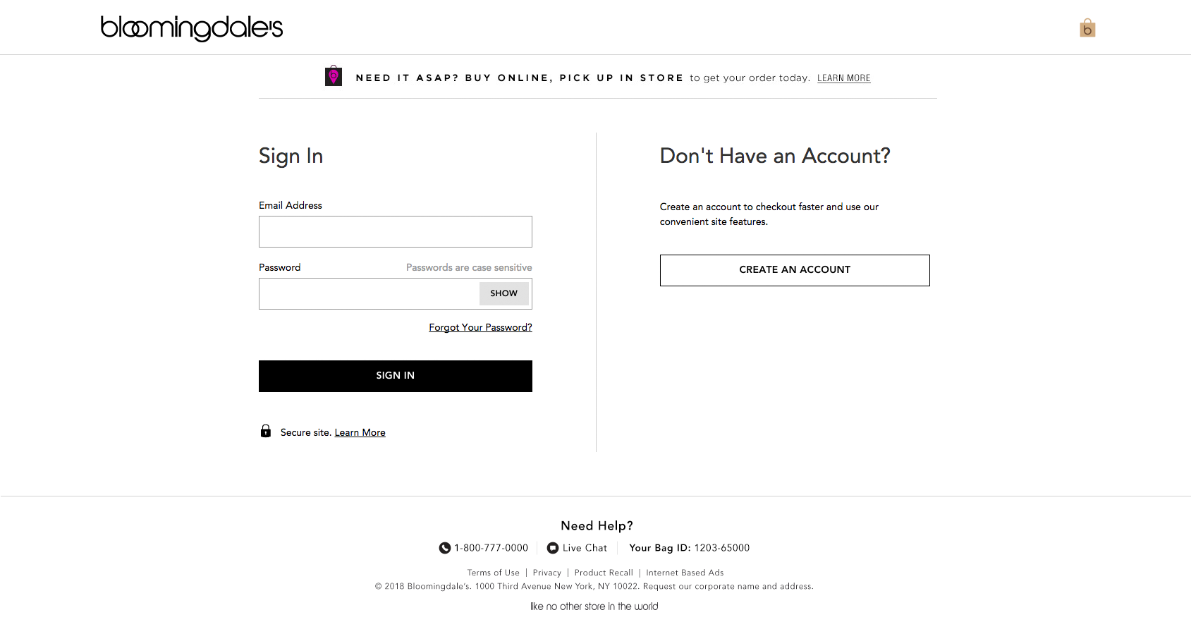
Once we had one under our belt, we moved on to International site navigation, registry navigation and minimal navigation (used for checkout and sign up/sign in). Each piece of the site was went through rounds of internal testing and bug finding before release to the public.
The RESULT
The navigation redesign reduced the amount of development work (cost) in the future because many of the hard coded systems in place were replaced with content management systems so that each prospective sales team could update their facet of business on their own. The redesign fixed the broken and confusing navigation that was hindering registry users; mobile traffic increased on The Little Registry site by 5.5% after both the navigation and the registry redesign went live.
Reflection and Future
This redesign gave me a chance to interact with almost all teams across the site and gave me a window into what drives their sales. That being said, I think there was a better way for the review process to be structured for such a large piece of the site. Everyone involved should be present in one room to debate amongst themselves in order to come to clear actionable points. Many times we had conflicting feedback that wouldn’t come in until after a feature had gotten far along. However, I think we pivoted quickly and made the best of the time we were given. In the future, I would like to see more personalization incorporated into the experience; even just being able to identify how many loyallist points a user has is a great enhancement.
