The Knot Brand Refresh
ROLE
Art Direction, UI, Illustration
OVERVIEW
While Freelancing at The Knot as a product designer for the Vendor Marketplace team, I was participated in a brand refresh exploration, in which all product designers (6 in total) collaborated together to pitch new new coded style guide elements and illustration styles across the site. At this time, the site was being reviewed to determine how to breathe new life back into the site and refresh the brand as well as make it responsive. One problem I set out to address was the lack of images available for editorial posts for which a solid color tile would be used in the event of no image. The other is to continuously apply an effortless feel of all-inclusiveness regardless of race, gender or sexual orientation.
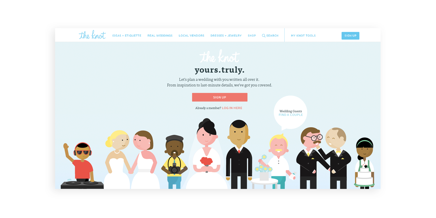
Above: An exploration of what the home landing image could look like if done in simple illustration.
OBJECTIVES
I was brought onto this project because I was the only team member who had illustration skills of all of the product designers, and my boss had a lot of mood boards she had pulled together but wanted to create her own examples of the direction the brand could take. The problem was that the organization had no idea how to scale such an effort.
The Approach: Personality Through Illustration
My first project at the company was to work directly with my developer to make the navigation responsive with a slight redesign. This was the first effort made in the responsive design front.
Next, to prepare for a redesign, management and tech determined that all sections of the site had to be using the current pattern library. The development team built a sandbox to show which elements for each team’s portion of the site was not adhering to the library and over the next few weeks I worked with my developers to adjust years of previous customizations.
After that I turned my focus toward creating some simple illustrations with basic shapes that anyone might be able to create or maintain. A simplified style might be easy enough for someone with little illustrator knowledge to pick up. I started to apply them to the editorial parts of the site. Meanwhile, in the Vendor Marketplace I started to incorporate small elements with my illustrations which added a new little pop to the page. I also assisted other product designers with their pages which needed some added icons and illustrations, the largest of those tasks was the Bride’s Registry Checklist. These illustrations evolved into a series of simple illustrated vendor type images with personality.
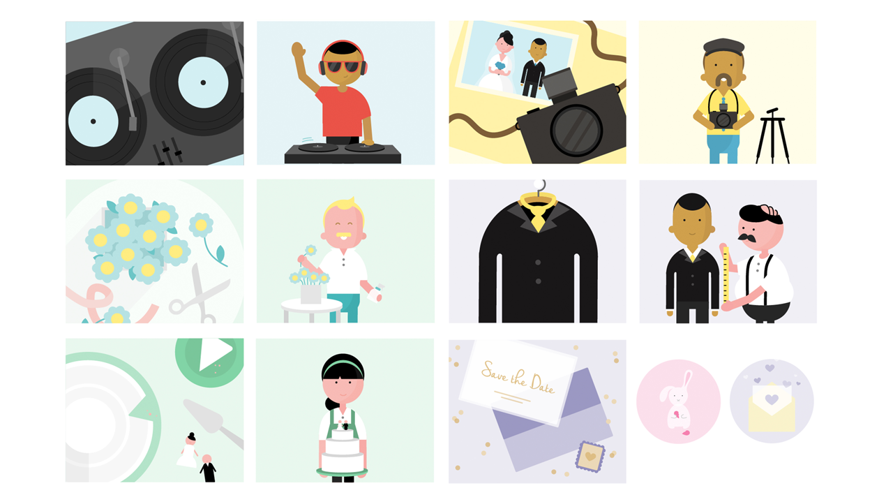
Above & Below: Illustrations and icons for the registry checklist. Illustrations include things like: book your florist, buy your cake, rent a tux etc.
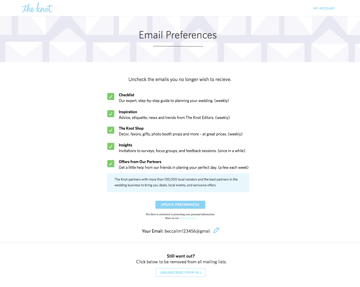
Above: A live piece of the site that had a test illustration on it.
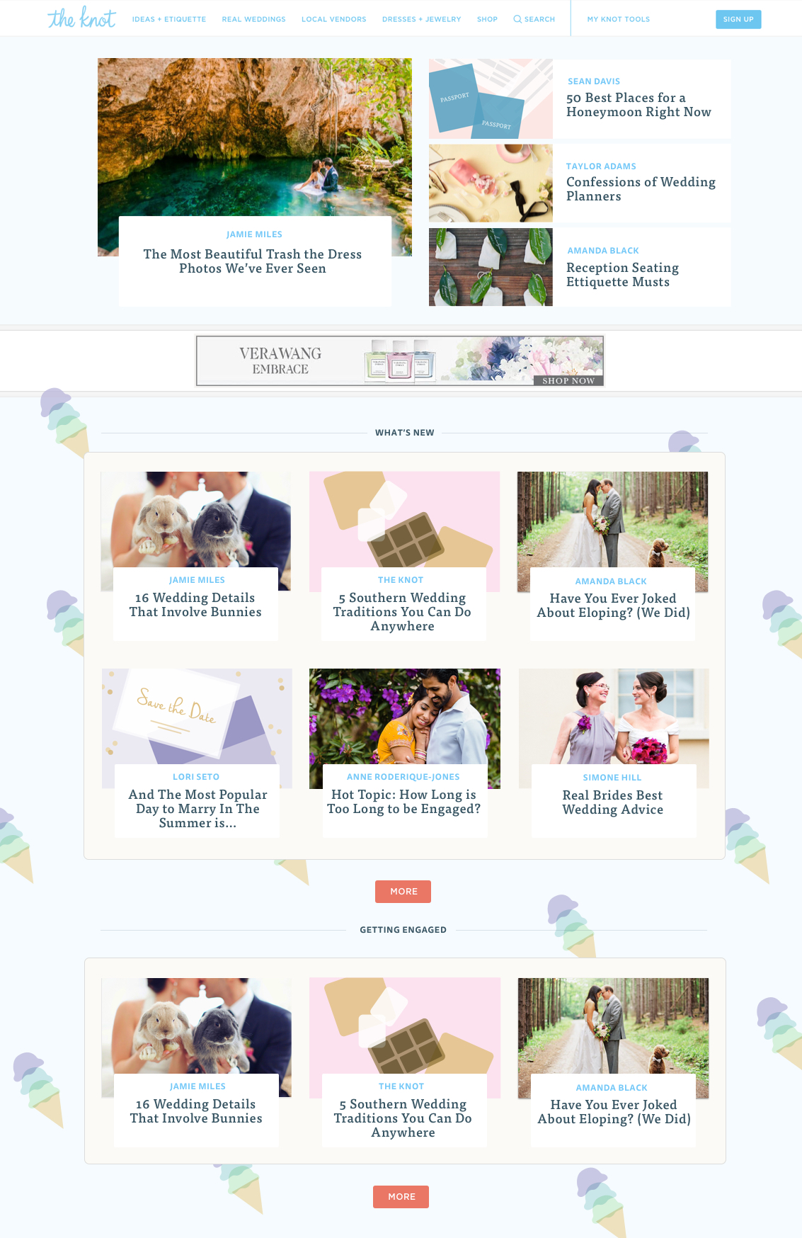
Below: A site redesign mockup with color, font, nav and illustration updates. The navigation went live, as did the font changes.
The RESULT
This effort was something we were all very excited for. The first redesign elements to go live were the navigation, new fonts and a few other small pattern library elements. However, The Knot still struggles with a short supply of illustrators needed to maintain their illustration effort. Shortly after I received an email from a former coworker at The Knot who had a fun new venture he needed help with!
