Minted Cart & Checkout Replatform
Role
UX/UI, Strategy
Duration
1 year +
Overview
Purchase was the first part of the site experience to get replatformed. The additional challenge here was that engineers were still learning the capabilities of the new platform and in some cases learning the ins and outs of the old platform. This was also the first part of the website to have a new front end fully built using the design system. The MVP was focused on using existing data and customer insights to make better user experience and set up the framework for future enhancements and iterations.
Replatforming was new to Minted and purchase was the first area of the site to migrate to a new platform. A retrospective was done at the end of this project that helped inform and shape the category page replatform approach.
The challenge
Context
Minted’s digital experience needed to be replatformed. Site experiences were limited to what the monolith could handle. The company vision was for the customer experience to be driven by best-in-class, scalable, flexible, efficient tools that help the user discover and purchase products in a quick and frictionless manner.
Problem
Replatform and redesign cart and checkout to enable a stable flexible, scalable architecture. Additionally:
Provide consistency through systems
Make it easier for users to get through cart & checkout
KPIs
Primary: conversion
Secondary: Cart to checkout CVR, cart to order CVR, abandonment
Also tracking: Performance
Constraints
Product attribute data will also not be migrated yet. No updates to tooling or services will be made for MVP. Order confirmation page and post purchase experiences are out of scope. Promotions cannot be applied at the item level (we did not know this last one until later). Log in must remain between cart and checkout.
Starting with research
We got qualitative feedback from users in cart however checkout requires a log in and it becomes harder to follow the user due to fraud and security issues. Additionally I could watch users go through full story to see what frequently seemed to cause friction, again you cannot see details in checkout. As an added bonus, hardly anything was tagged in cart and checkout so it was hard to use data.
Best practice & patterns
I took an audit of our cart and checkout experience on desktop and mobile with various product types and noted the edge cases. I relied heavily on competitive analysis, and Baymard best practice for this replatform effort.
These are specific patterning examples related to price display at the attribute level in cart. The first line up indicates retailers who do not show attribute level price breakdowns and the second shows retailers who do. This type of deep dive patterning was used to help facilitate discussions with engineering about feasibility as well as support discussions with crossfunctional partners and stakeholders.
Cart design ideation
I adopted a modular design methodology, identifying reusable elements between cart and checkout experiences. Critical components such as subtotals, promotional code interfaces, and line items were designed with scalability in mind to maintain consistency across the purchasing journey.
By sharing designs regularly with the UX team, product partners, and stakeholders, we could refine ideas quickly while keeping everyone aligned on the vision.
Building a journey specific component library
While designing, I collaborated closely with engineers who were building a specialized component library for the purchase flow. This partnership helped us spot potential issues early rather than discovering them later in development.
Late technical discoveries
However, we hit an interesting challenge when we learned the new platform couldn't support the detailed price breakdowns and promotional pricing displays that existed in the original Minted system. This required some creative rethinking of how we displayed product information while keeping the experience intuitive.
This is an example of a complex component (line item) with documentation that was built in the purchase specific component library. The documentation would also be reflected in storybook.
The original Minted cart experience
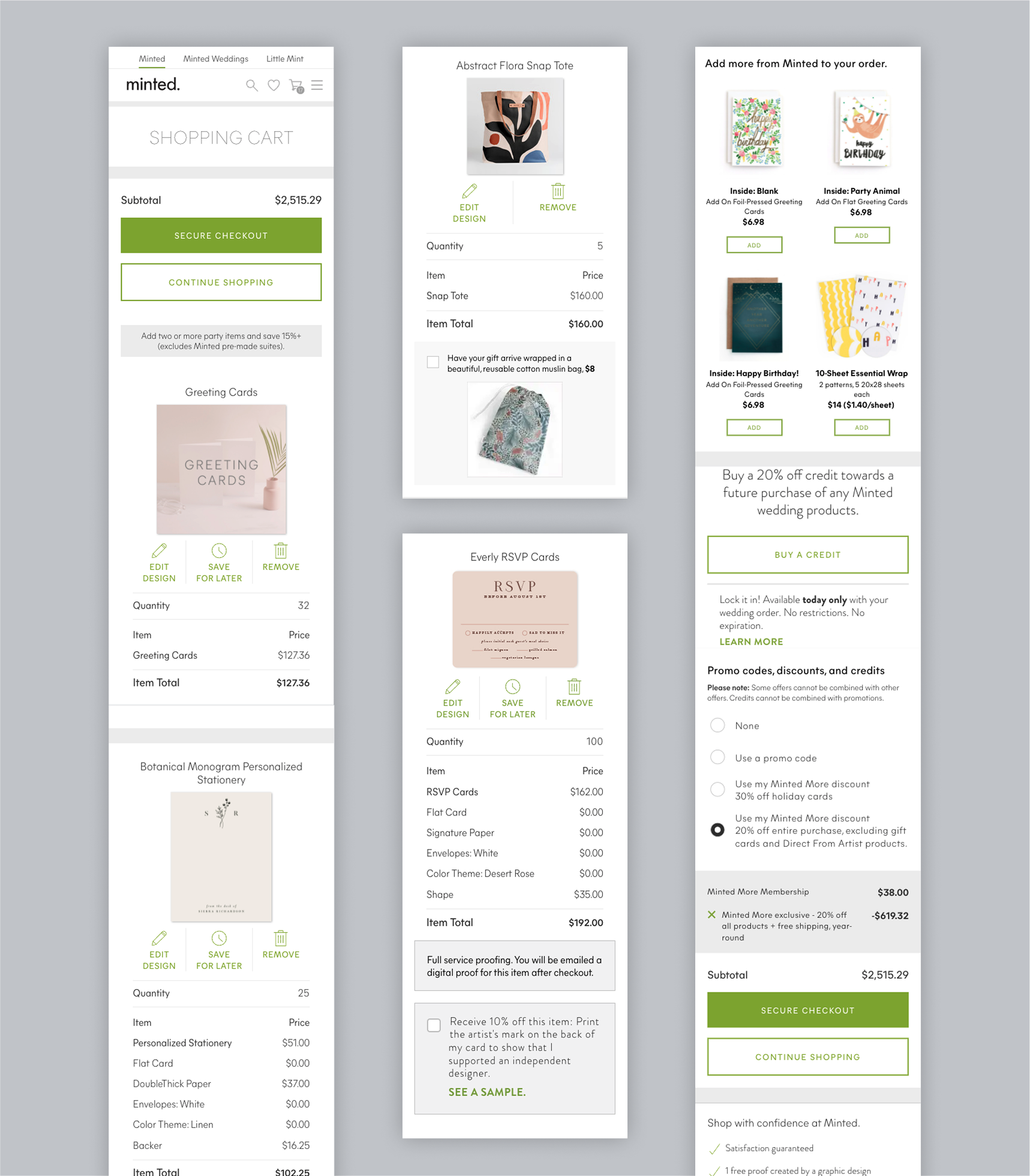
Cart MVP design
After some quick pivots due to tech constraints and some revisions to the wires we had our library built and our front end in place. Here are some of the updates that were made to cart:
A clearer way to apply and remove promotions
A standardized template for line item data display
Parity between desktop and mobile
AA compliance for visual accessibility
Performance updates, especially on page load (I added a skeleton) and when removing items.
A more defined area for upsells (product recs, minted more and wedding credits)
Clear and consistent alerts and feedback
The video is a prototype of the new cart as well as some screenshots below. Note: this does not encompass all scenarios.
The original Minted checkout experience
Checkout design process and re-evaluation
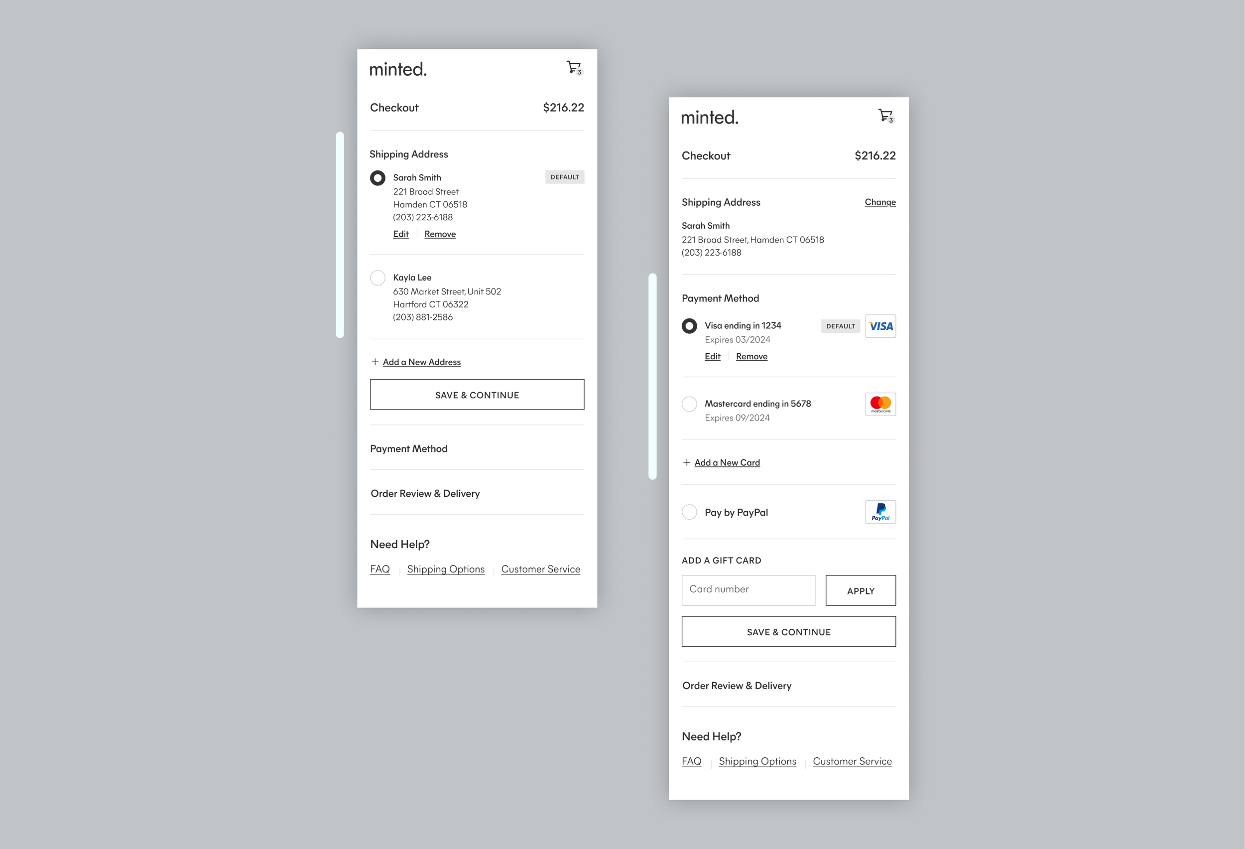
Initially, I designed checkout with capabilities for multiple saved payment methods and addresses. However, I discovered that our account services hadn't been migrated to the new platform yet—our user data was still stored in a simple database structure that only supported single-entry overrides.
Upon hitting this roadblock I scaled back and put my MVP in check. The enhancement was not abandoned but filed away for consideration once services had been migrated.
A note about documentation
Throughout this project I used a figma working file, a figma presentation file and a figma handoff file system. When working on the handoff file, each page corresponds to a story that links to a jira ticket with acceptance criteria. I like to document acceptance criteria is confluence first and then add the information to a specific ticket linking everything to close the loop. I would join grooming and sprint planning meetings to discuss ongoing work with the team and answer any questions.
This is an example shows multiple saved addresses and payments.
Checkout MVP
I leveraged any modular components I could and picked up alert systems from cart. The way that Minted purchase used to work, all items would be grouped into a single order regardless of the fulfiller which could cause items to be delayed. Due to this tech constraint we needed s robust alert mapping which my product manager and I worked to revise and document.
Here are some of the updates that were made to checkout:
A clearer way to apply and remove promotions
A standardized template for line item data display
Parity between desktop and mobile
AA compliance for visual accessibility
Performance improvements
A streamlined view of your order and shipping options (that would help set us up for future enhancements)
Minimal header to reduce distraction
Clear and consistent alerts and feedback
Post launch adjustments
This test had some dips, so I used Full Story to analyze and see what was getting users stuck. We also took some users through the experience in user zoom and in doing so got valuable feedback regarding friction. The majority of issues were engineering bugs that were easily repaired.
One UX issue that came up was around the logic for completing your order. Each section must be filled out with all the required information and the user must hit save and continue. Until all of the required info is filled out and save and continue is tapped the place order button should be inactive. Due to the save and continue button being a secondary button users were overlooking it and rage clicking on the inactive place order button. A quick component swap solved the issue and directed the user to the active primary buttons they needed to engage with.
Takeaways
There were some tagging issues and along with muddy data from user journeys which was disappointing. We also started to see some cart abandonment when users were navigating from customizer to cart. We frequently see users go to cart look at price, look for a promo to add and hop back to customizer to see what feature they can remove to lower their cost. One theory was that by removing attribute level price breakdown (due to tech constraint) we may have exacerbated the problem. The next move was to test adding it back into the line items.
This project was a one and done, there were not enhancements in the roadmap post release. It took at least 6 months or more before the cart and checkout was revisited. There should always be a phase 2 or at least time to iterate on the things that need improvement.
Future Enhancements
Tooling updates
We need to replatform account services to unlock things like multiple saved payments and addresses.
Replatforming promotions is a huge task but would help to unlock some of the UX recommendations moving forward.
Tap to apply promos
About a year later a test was run to tap to apply promos.
Users are looking for promos and want an easy way to apply them. The business prefers they forget to apply it. An age old conflict of interest.
Line Item promotions & attribute pricing
A test should be run to add attribute level pricing back into the line item.
In addition, with reliance on the promo tooling replatform applying promotions and discounts at the line item level is fairly standard.
Sign In/Guest Checkout
Test migrating sign in into the checkout page rather than using an interstitial page. Currently the sign in page breaks analytics tracking from cart to order.
Additionally trying out some sort of guest checkout.
Additional payment methods
Currently Minted only supports using paypal in additional to credit cards.
Explore other options that are more relevant.
Grouping shipments within an order
I also worked on this enhancement about a year after the release of this project.
This would help reduce friction and alerting when multi item orders cause delays.
Update order confirmation
As the last touchpoint of checkout this page is hard to make a case for. It typically does not generate much revenue however it is the last brand touchpoint a user will see before leaving the site.


